Our Museum
Rebranding
We were required to design a graphic identity for the Our Museum project that embodies its principles, values and motivations whilst leaving a memorable impression. The graphic identity must include a logo and brand guidelines that demonstrate how the identity works across different brand touchpoints. This must include an example of how the identity would work online, such as for web and social media as well as in printed form, such as a poster, but can also include other assets, real or imagined.
This was a collaborative project with 3 other students.
Logo.
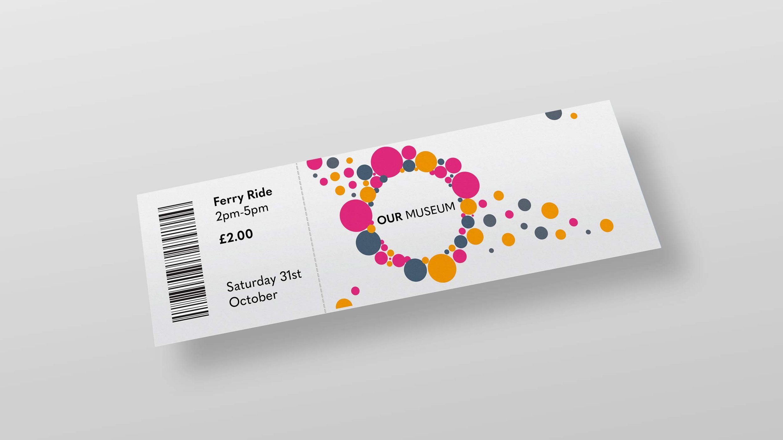
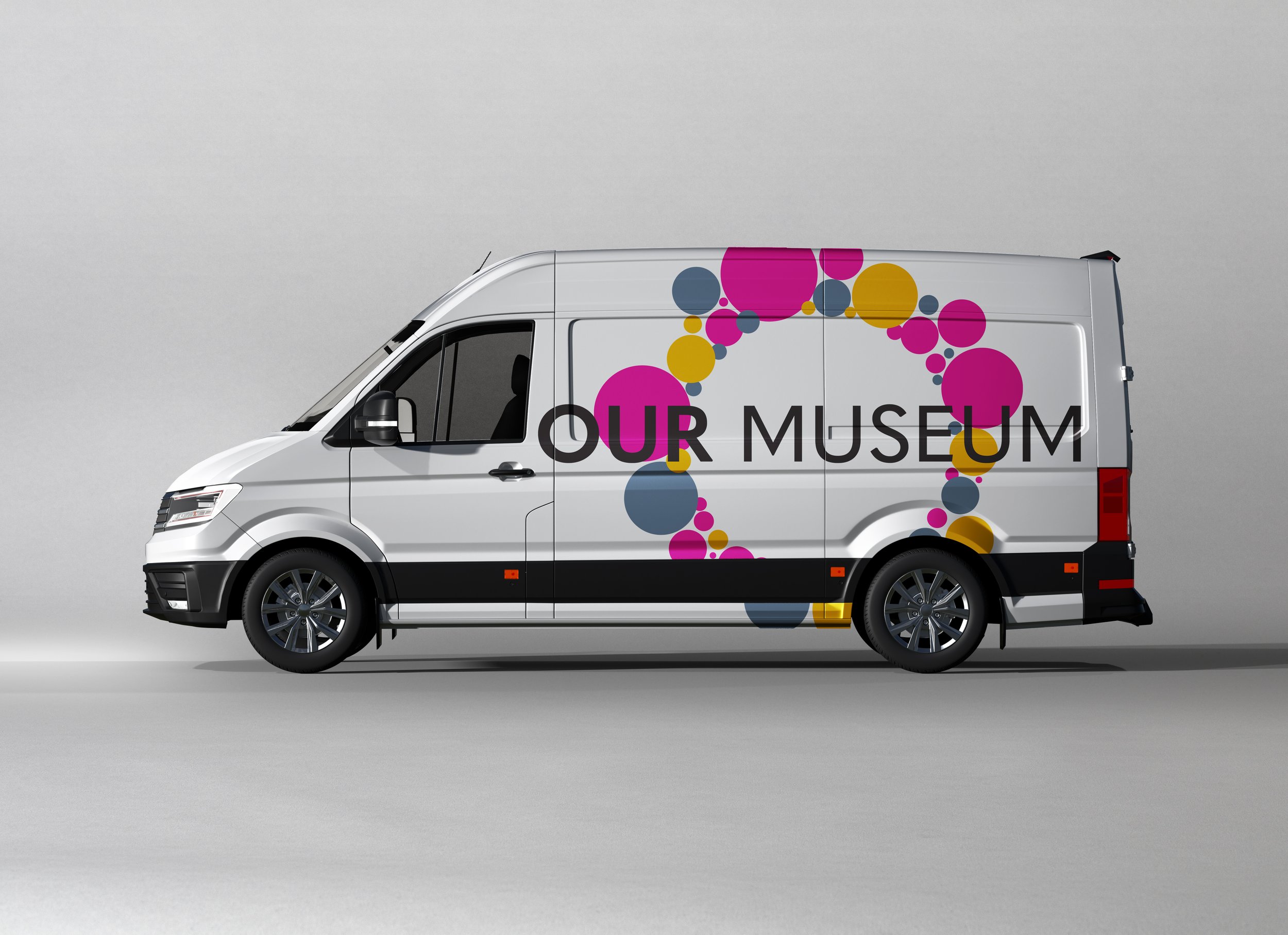
This is the logo we designed for Our Museum. The circles around the text represent the surrounding community and that everyone is welcome. The colour orange gives the feeling of excitement, enthusiasm and warmth. The colour grey is a cool, neutral and balanced colour which can be seen as modern, and sophisticated. Finally, the colour pink is associated with calmness and love. It is a positive colour and vibrant shades can be very stimulating.
“Our museum engages the community, turning history into experiences.”
- Our Manifesto
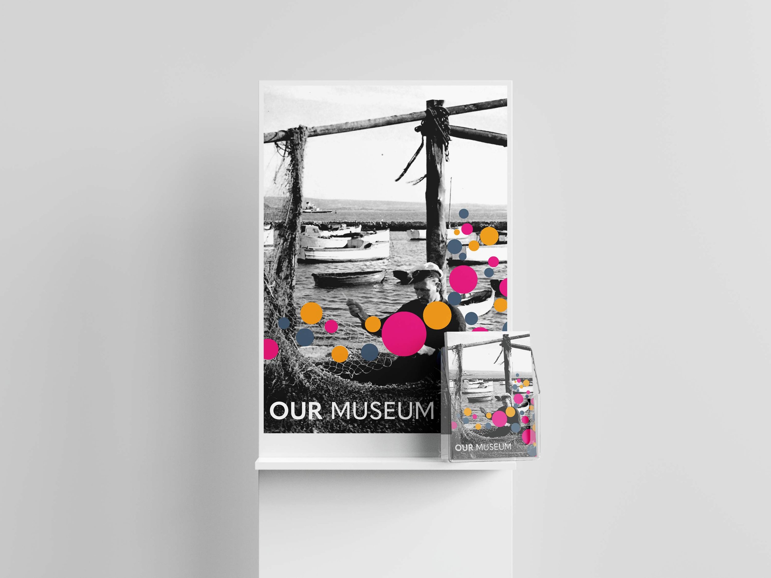
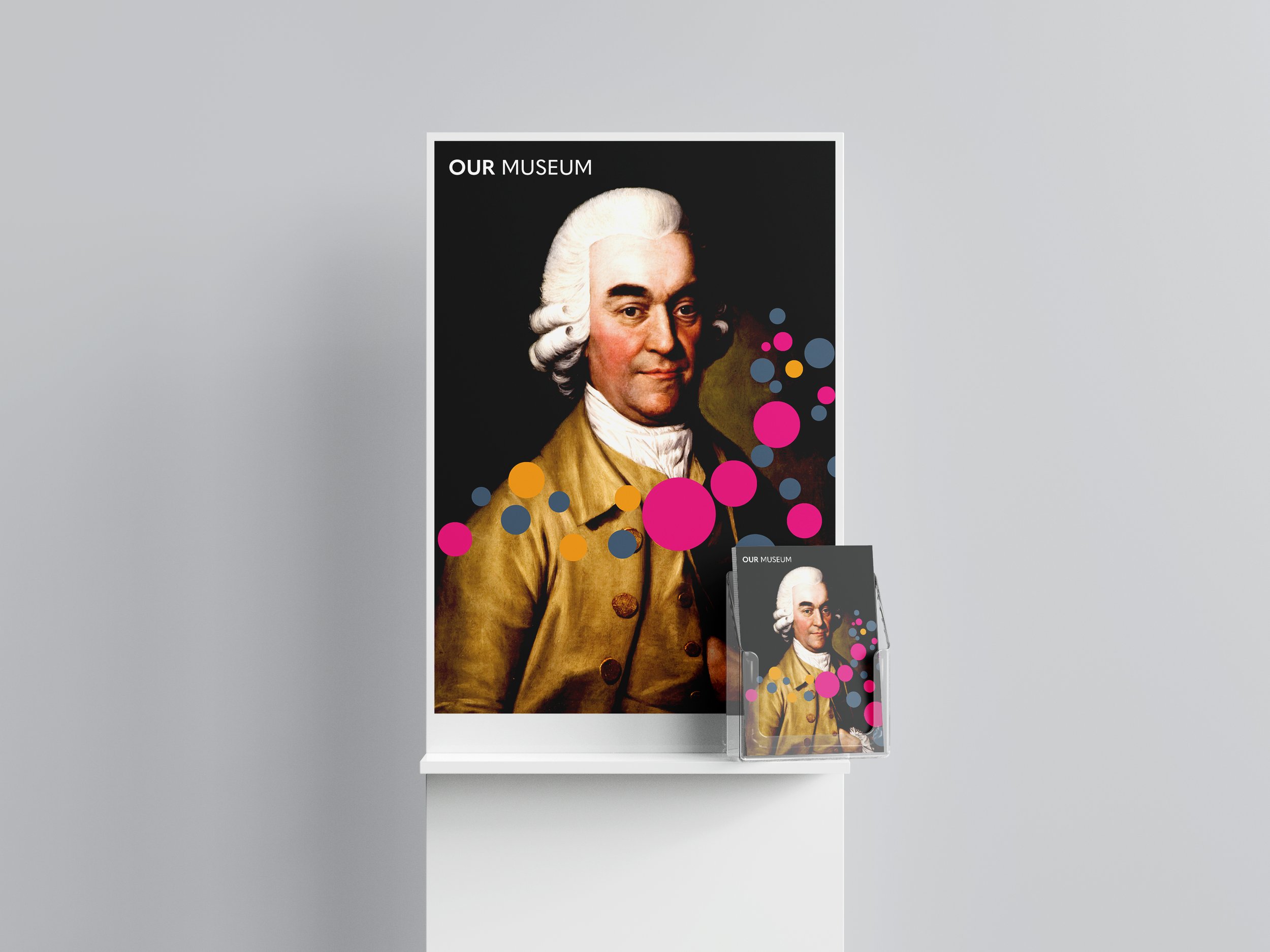
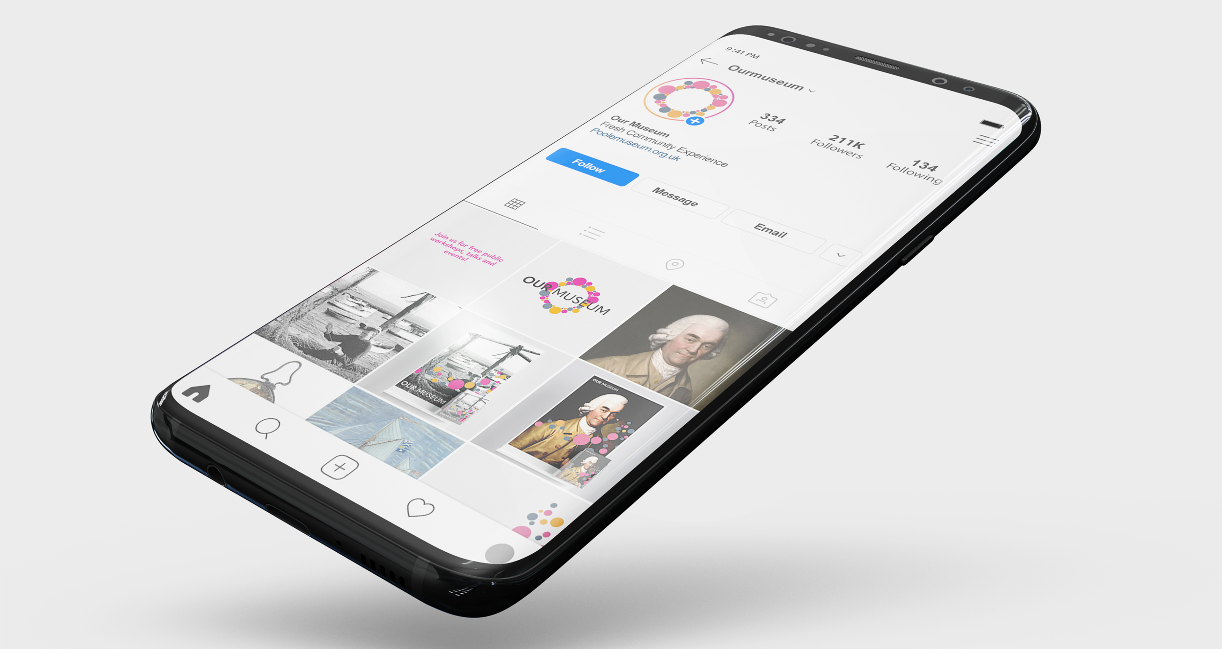
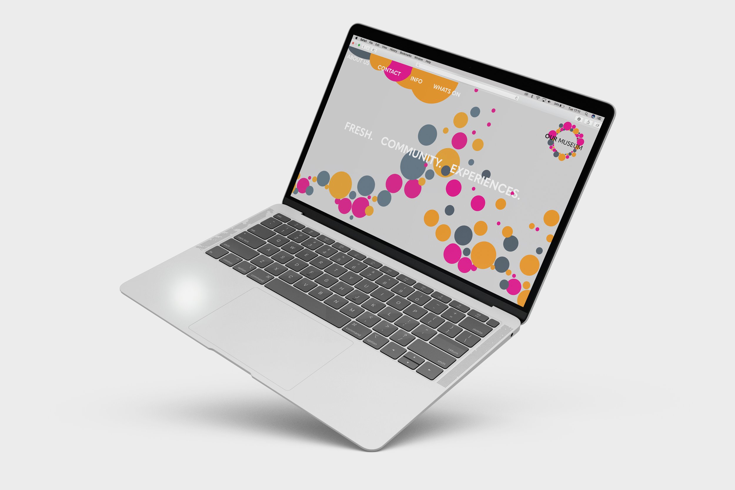
Advertisement.
To advertise Our Museum we thought that digital advertising would be a good route as they can capture a younger audience to visit the museum. Instagram would be a good platform to keep the visitors up to date with new experiences they are hosting.
We also designed a website which would be placed around the museum on interactive digital screens so the users can look up history about existing artefacts in the museum. This could have a potential for VR experiences.
Digital Advertising.
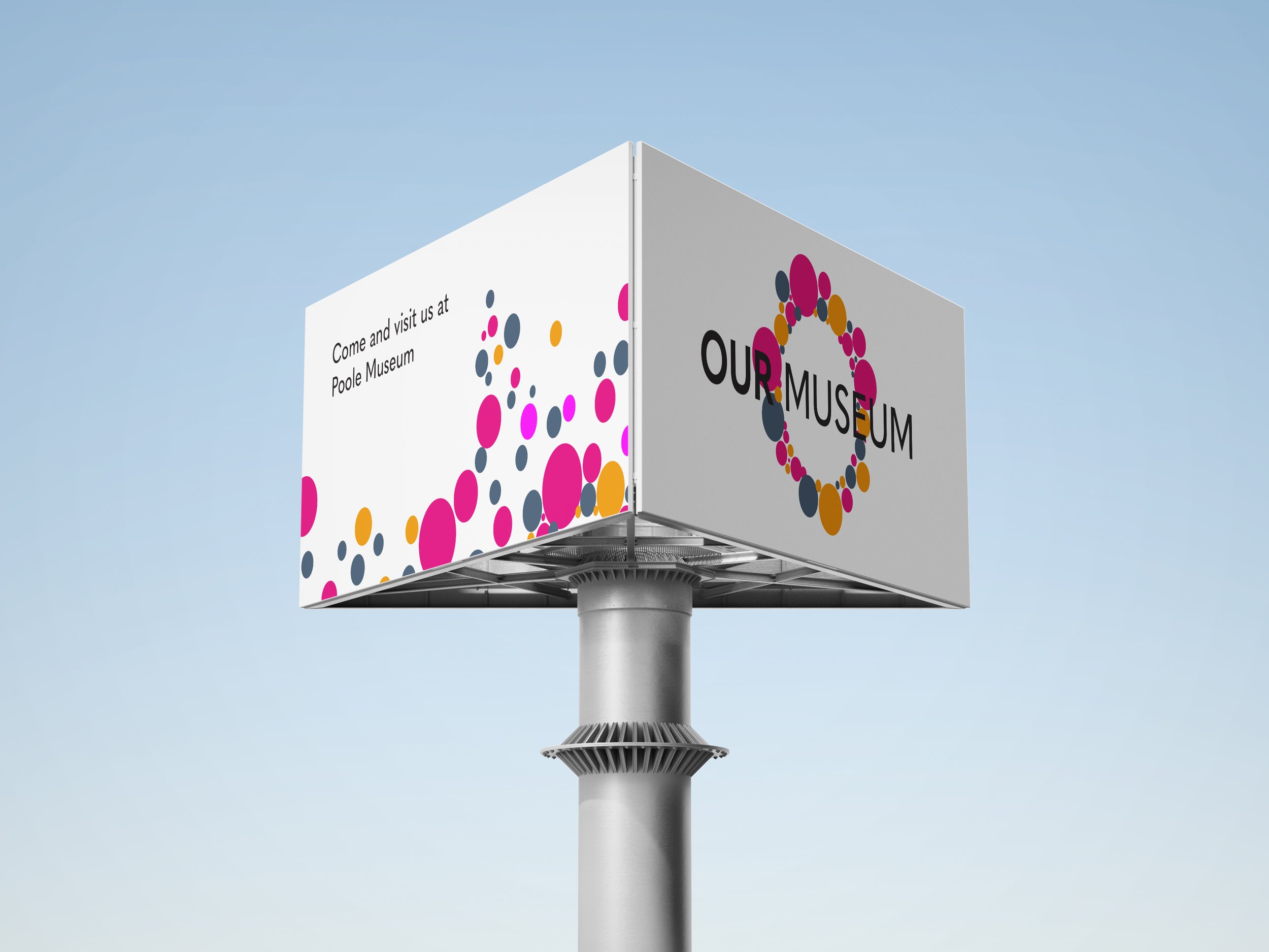
To gain a wider audience we thought about road advertisement. Using a large billboard on a motorway will attract more people to come and visit but to also show off their new modern branding.
Delivery.
During this project I learnt that branding isn’t just the logo and colour of a company, but how they use that style across their physical and digital interactions to present their brand qualities. I have developed skills like working well with a group of peers and how design can be developed over many areas of a brand. We thought that the project could be extended to other experiences like virtual reality and create an interactive digital screen. These could be placed around the museum so the public can look up history about specific artefacts.
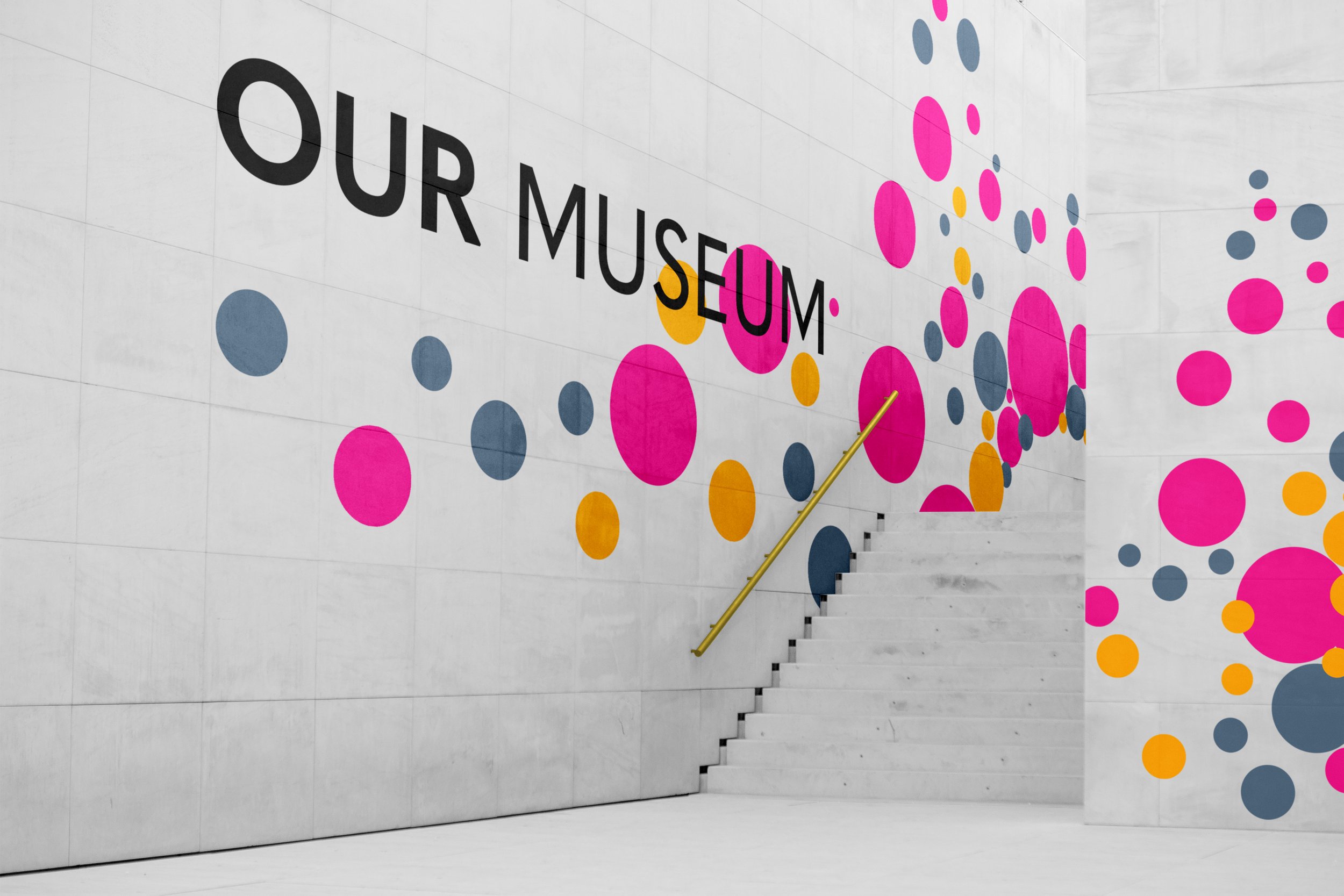
I think that the dotted pattern created expansion if they wanted to put it across a large space like a gallery wall, it also attracts more attention to the branding.

